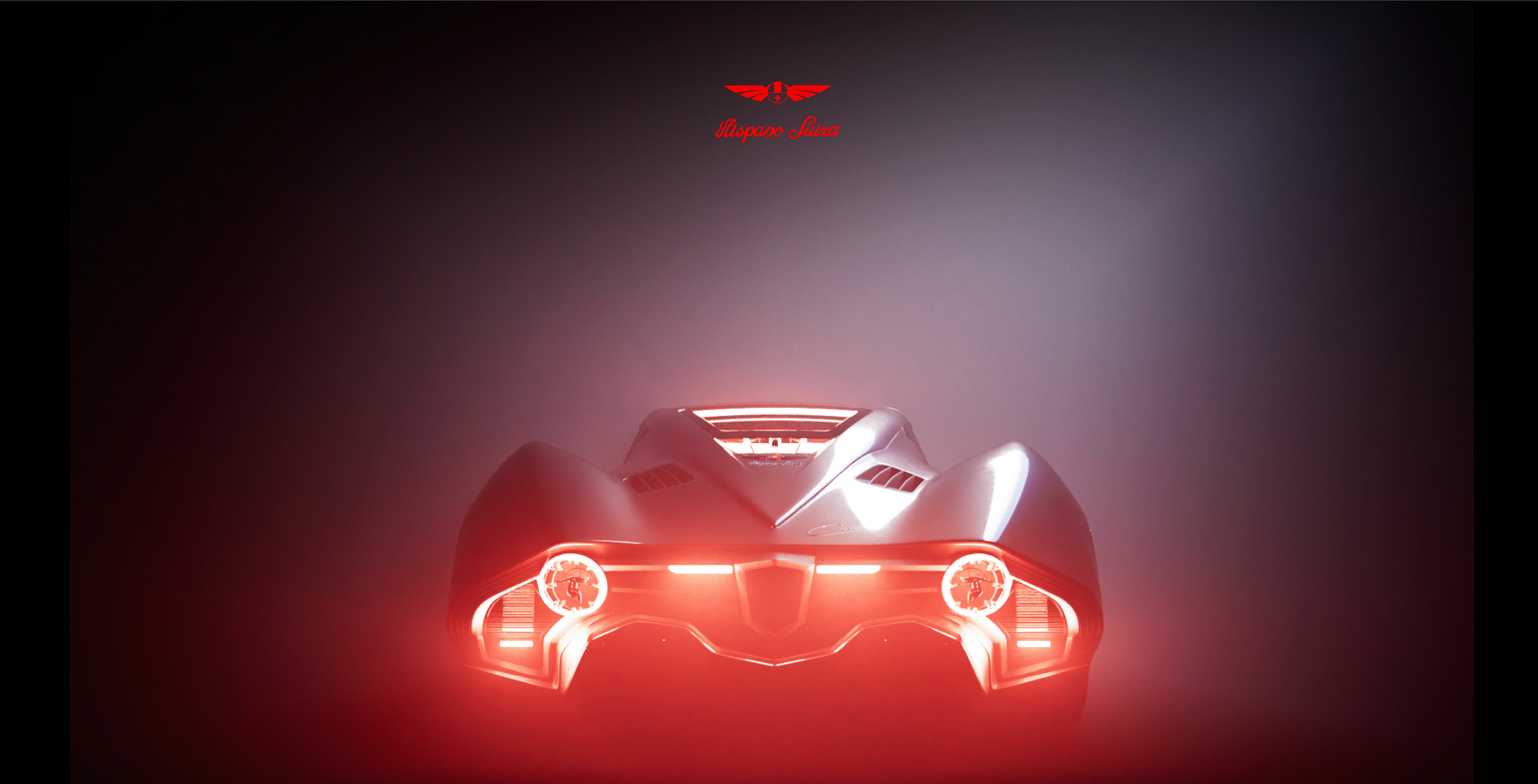
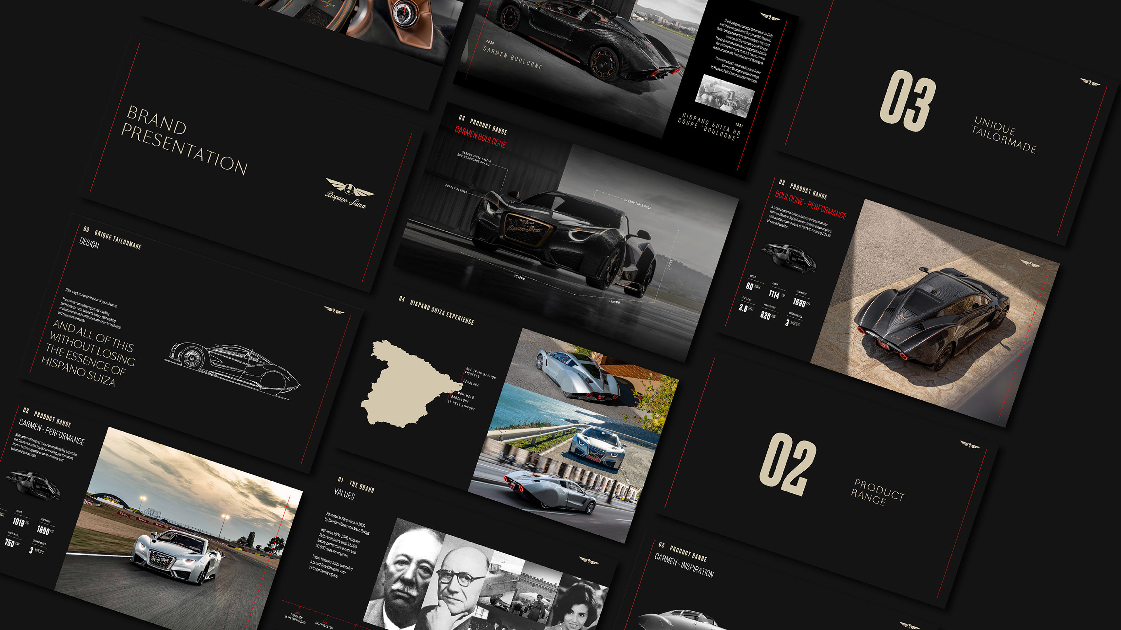
Born in 1904 in Barcelona, HISPANO SUIZA had nothing to envy to the Rolls-Royces or Bentleys of the time. Adored by royalty, intellectuals and celebrities for its stylish cars, HispanoSuiza became synonymous with luxury and exclusivity, only available to a selected few. The brand ethos was the guiding star of the new visual universe.
VIDEO IMAGERY PRODUCED BY DAUGHTER STUDIO.

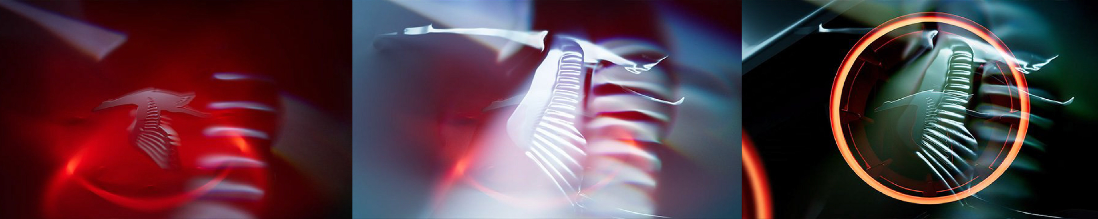
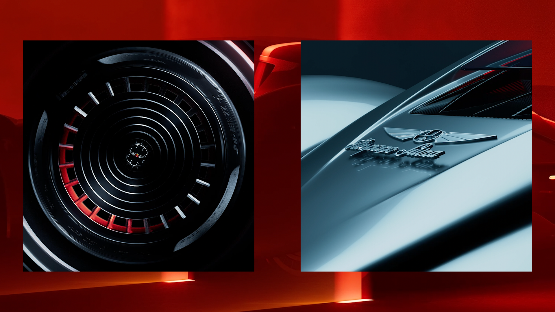
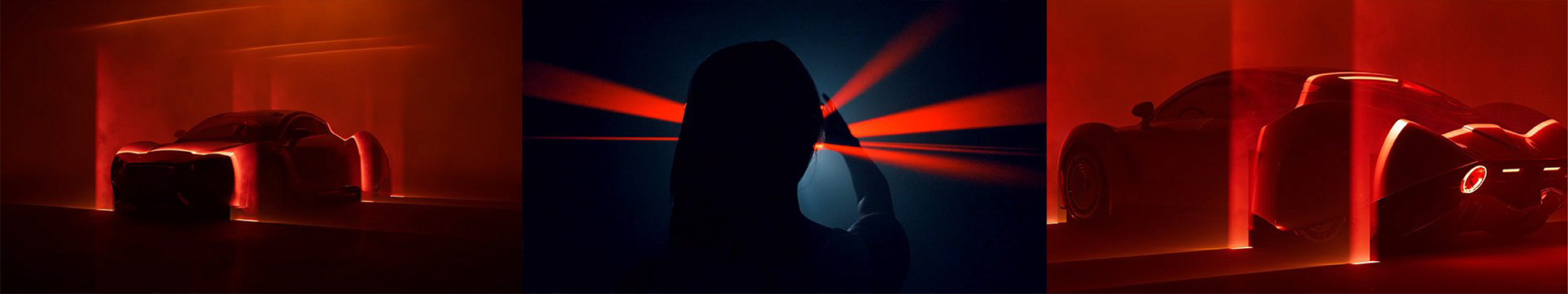
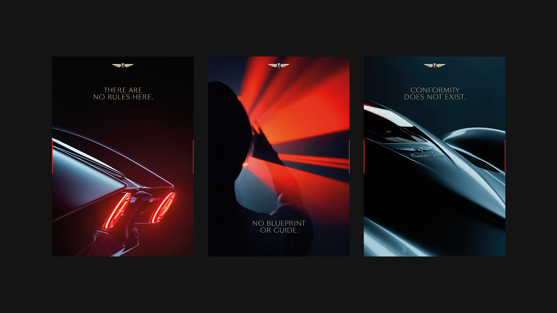
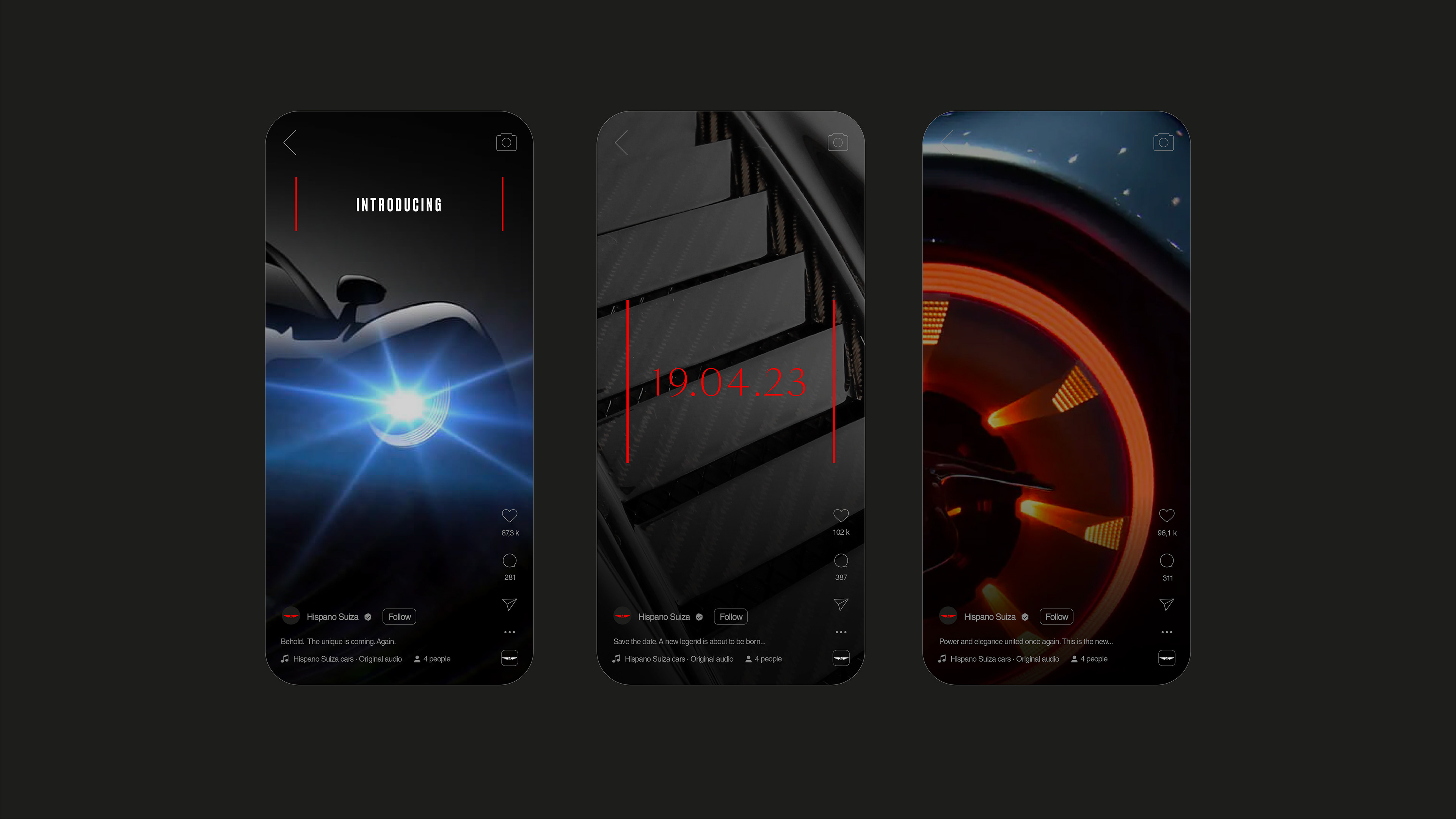
The "H" from the name became the frame that introduces the content. We elevated the visual language of the brand by incorporating a captivating typographic combination. SangBleu, chosen for its inherent elegance, and Druk, selected for its dynamic racing spirit. Additionally, we introduced a sophisticated shade of Red, symbolizing the harmonious fusion of Spain and Swiss flags.


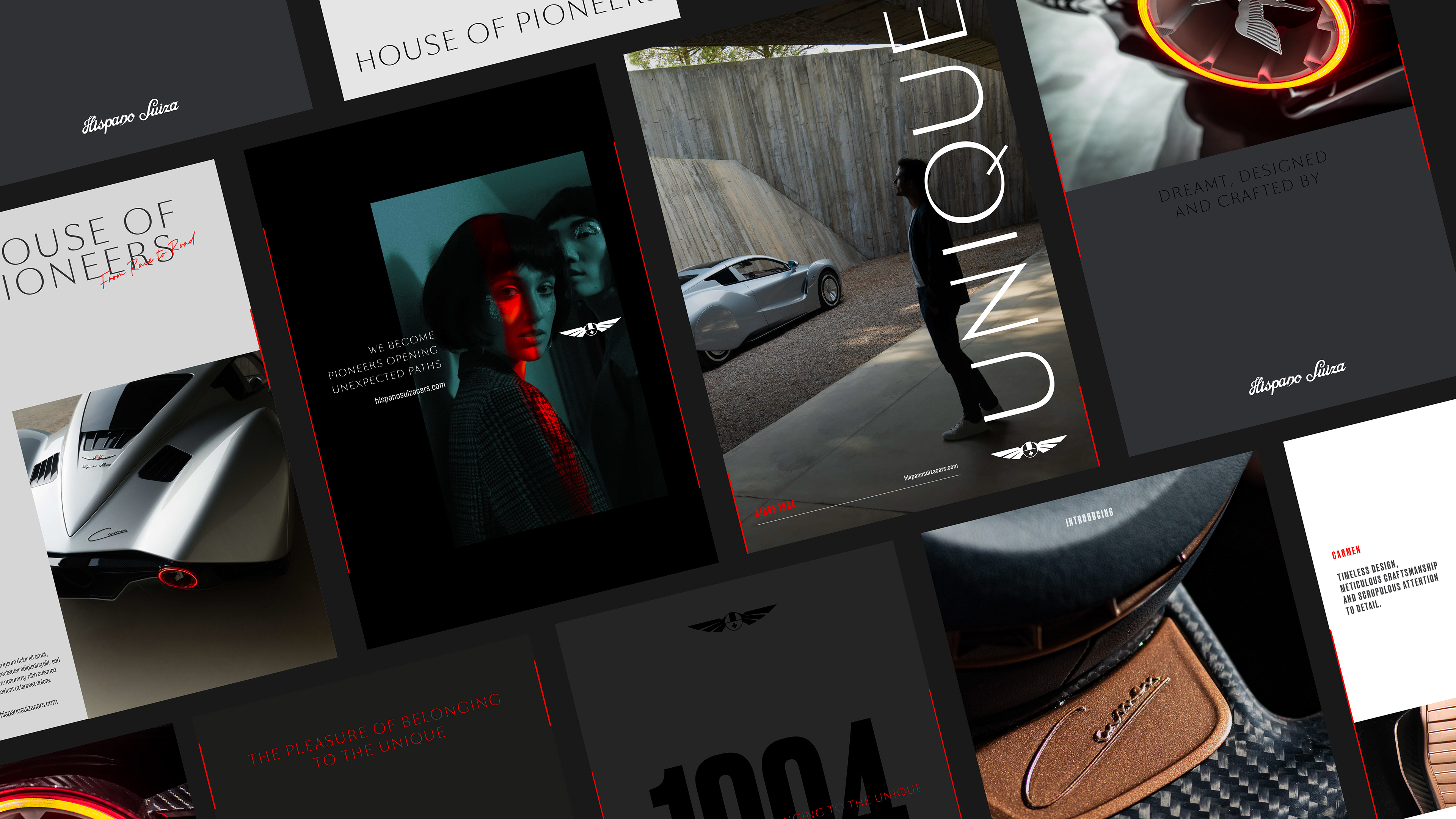

To further epitomize the brand's essence, we implemented the "H" layout system that blends engineering power with soulful appeal. This framework not only showcases our commitment to precision and craftsmanship but also encapsulates the brand's spirit of sophistication and allure.


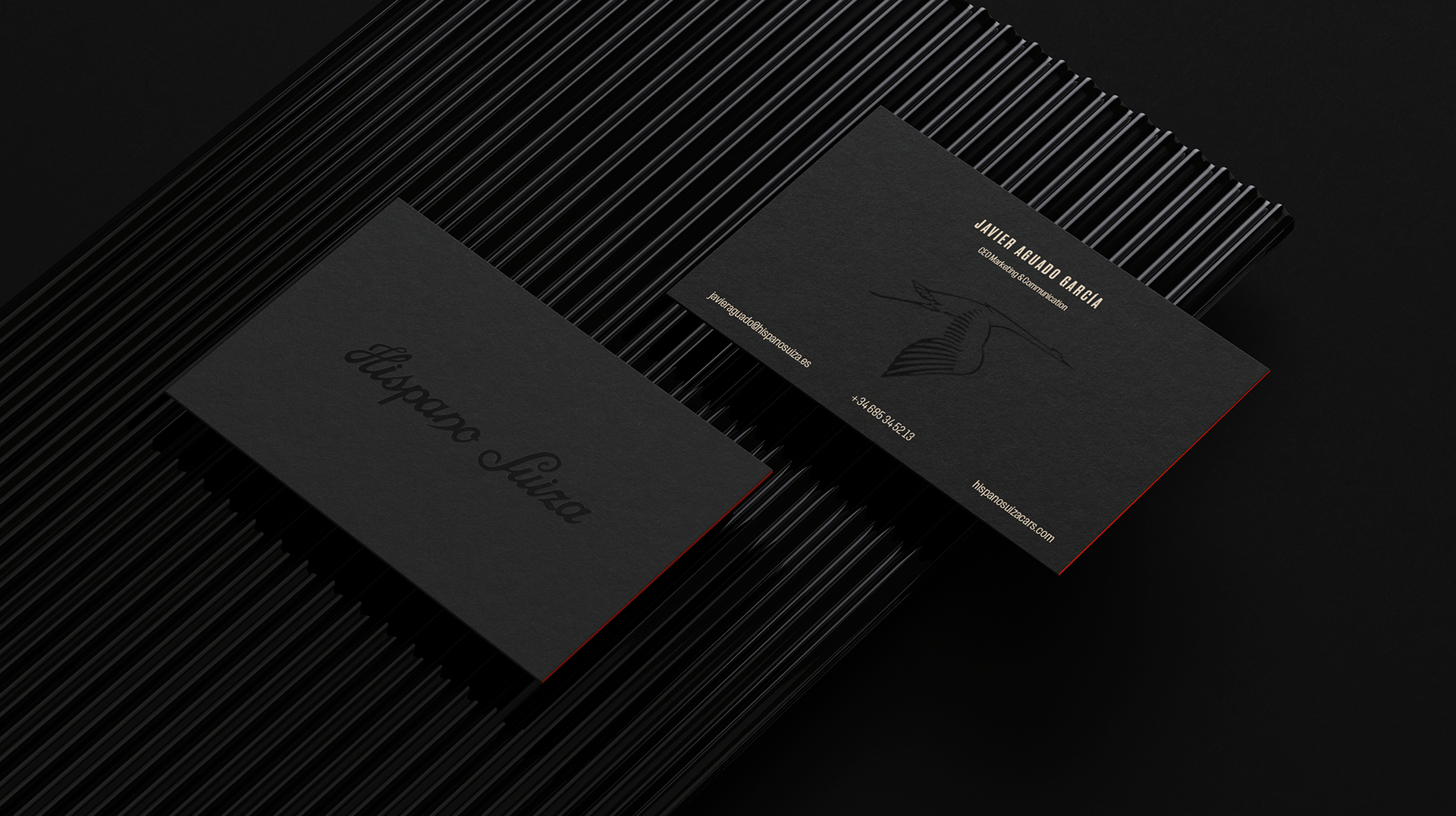
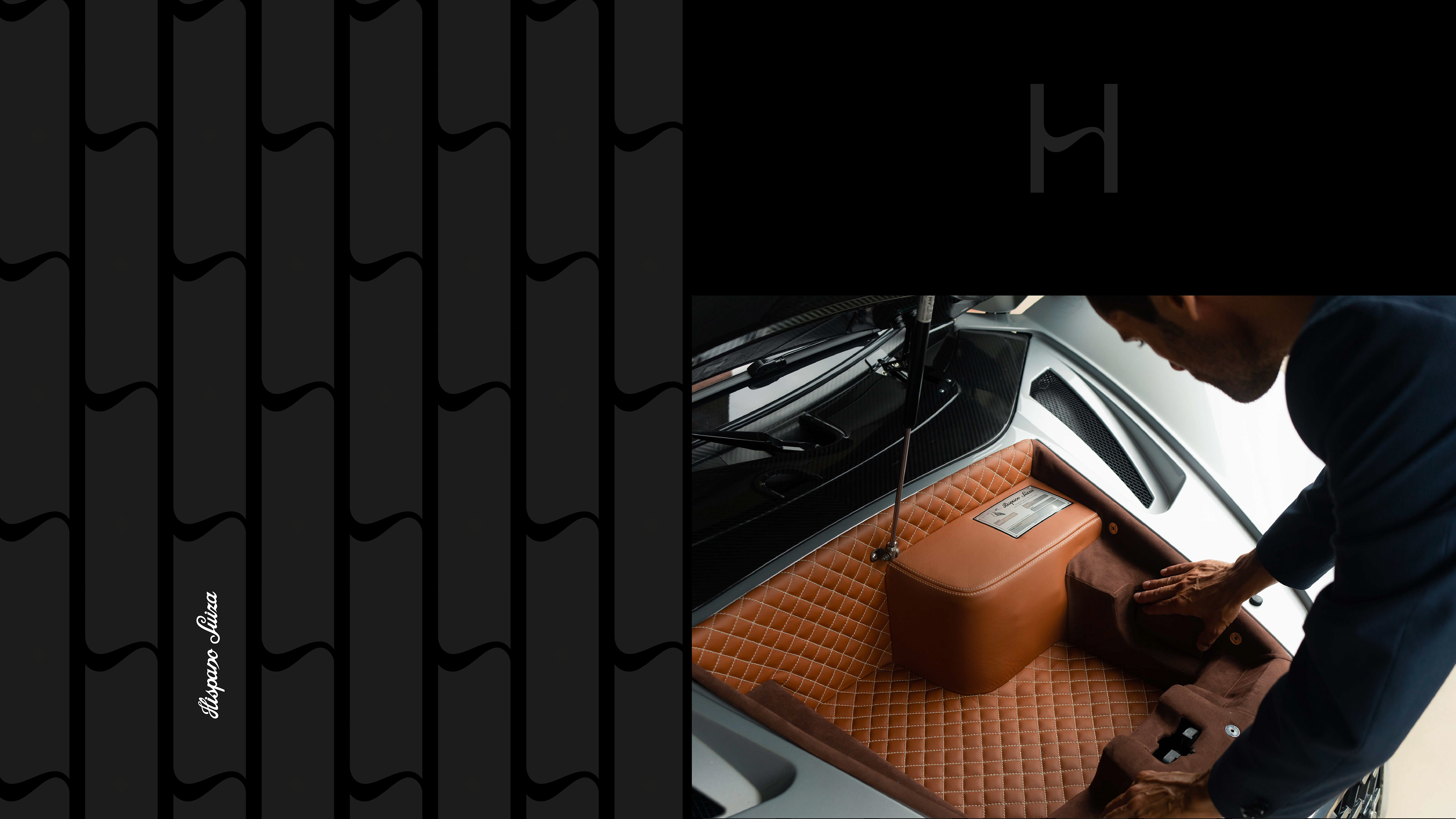
The HS Pattern serves as both a monogram and a luxurious design element.
Its future application extends to becoming an integral part of the car interiors, further accentuating the brand's craftmanship and prestige.
Its future application extends to becoming an integral part of the car interiors, further accentuating the brand's craftmanship and prestige.